Slider
From nectar LMS Version 5.1, a new feature is available for the start page: the slider.
With the slider, you can highlight new content, present images, news, or learning units, or customize the start page for groups.
Activating the slider
Navigate to Settings > Configuration > Settings > “Landing page header variant” and set it to “Dynamic.” Once “Dynamic” is selected, the slider is activated.
Important notes on use:
- Activating the slider applies to all groups.
- A static home page (image or video) is still possible as long as no elements have been added to the slider.
- If only one element is added to the slider, the home page will appear in the slider design, but with only one content element.
Adding elements to the slider
The slider must be activated for each group. New slider elements are added in the header settings. There you can specify how long each card is displayed (1) and add new elements to the slider (2).
Each element is displayed with its cover image, name, and type (3).
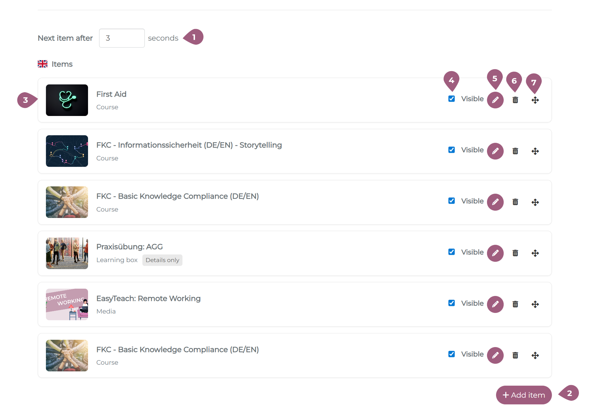
The visibility of individual elements can also be adjusted (4). If an element is not visible, no card will be displayed in the slider in the learner view. New learning elements can be selected using the pencil icon (5). Elements can be deleted using the trash can icon (6). The order of the slider elements can be adjusted using the arrow icons (7).
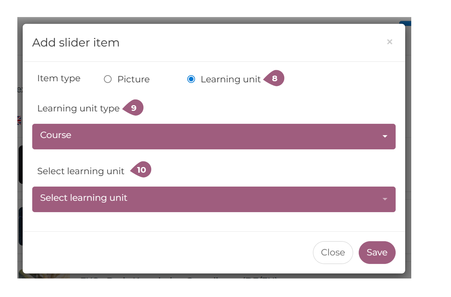
If you want to add new elements, you can choose between images and learning units (8). Images must first be uploaded to the LMS. For learning units, you must first select the type (9) and then the corresponding learning unit (10). The following learning unit types are supported in the slider:: courses, course series, learning boxes, media, and seminars.