Colors: Button color
Under Administration > Settings > Configuration > Colors and Menus > in the “Button Color” section, you can customize the colors for the buttons in your LMS.
1. Positive: Border – Background – Text
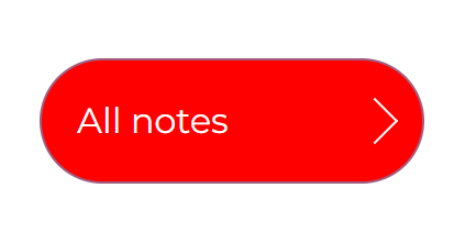
This applies to buttons in both the learner view and the administration area, including the dashboard, calendar, user and learning content view, and more. The following screenshot shows an example of a button where the border is black, the background is red, and the text is white:
2. Neutral: Border – Background – Text
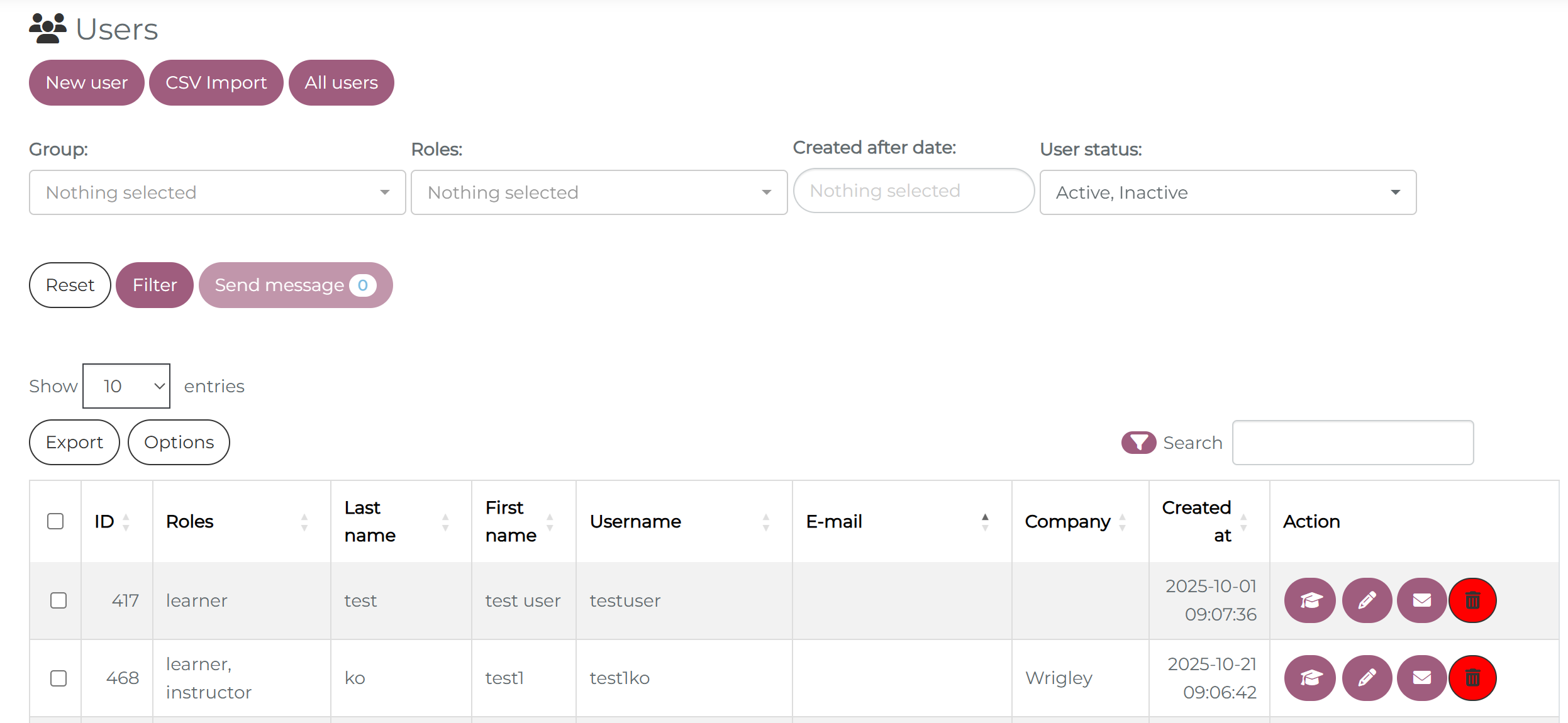
This applies to certain buttons such as the “Reset”, “Export,” and “Options” buttons, among others, in both the learner view and the administration area. The following screenshot shows an example of a button where the border is black, the background is red, and the text is white:

3. Negative: Border – Background – Text
This affects certain buttons, such as the “Trash Can” button in the user view and statistics, or the “Download SCROM file” button and the “Options” button. The following screenshot shows an example of a button where the border is black, the background is red, and the text is black:
4. Rounded buttons: Here you can adjust the rounding of the keys.
5. Show arrow on Buttons: TBD
6. Button text bold: When this function is enabled, the text on the buttons will be in bold.